A portfolio of media I create including photography, video production, audio production and easy to use web design.
Tuesday, June 29, 2010
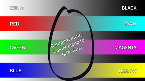
RGB + CMY = 50% Gray
I just saw a webinar from NewMediaWebinars.com on the topic of Color Grading using Apple's Color from their Final Cut Studio 2 suite of software. The demonstrator showed an illustration of what happens when you add complimentary (opposite) colors. He added to red, green and blue their complimentary colors- cyan, magenta and yellow respectively. The remarkable thing is that they add to create a 50% gray tone. Examine how each of the color primaries match up to the grayscale gradient on the background. In color mixing for video or web work adding complimentary colors can create drab, dull, gray scenes.


Subscribe to:
Post Comments (Atom)
No comments:
Post a Comment